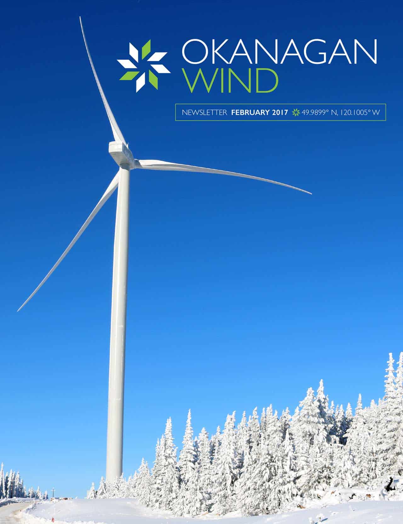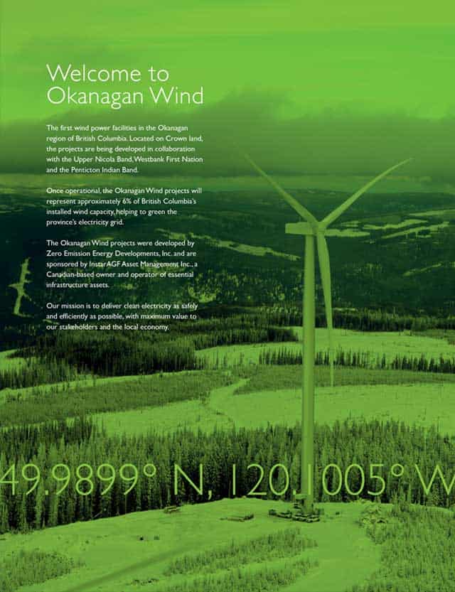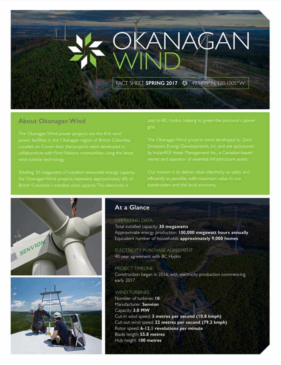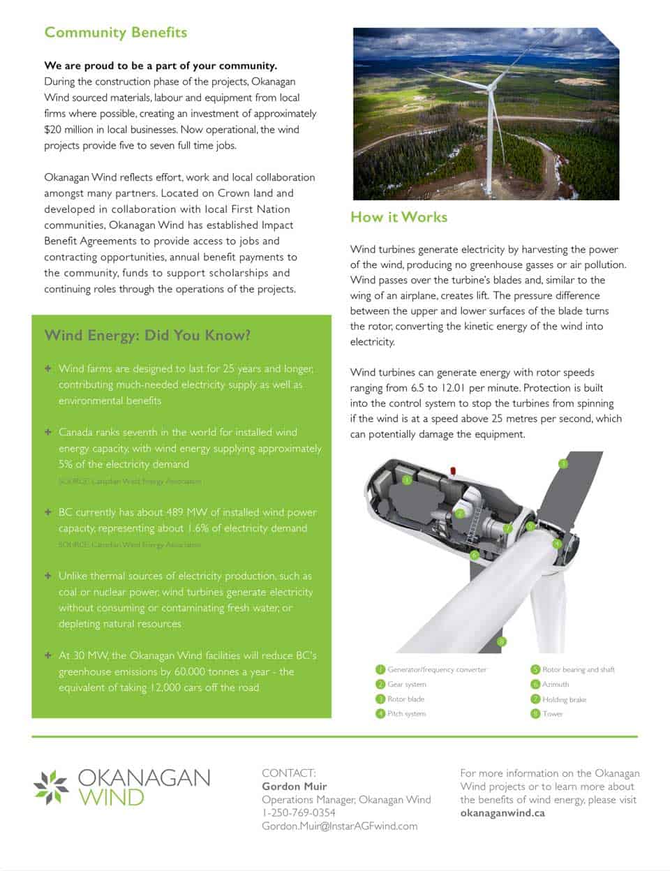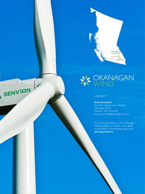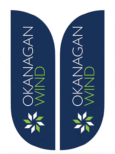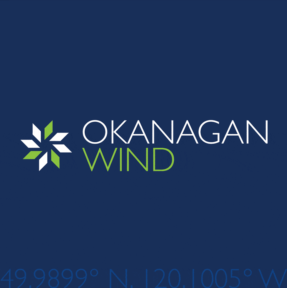
Okanagan Wind
Identity + Branding
Our client, InstarAGF, asked us to create an identity for one of their new wind power infrastructure developments in British Columbia. They wanted a logo/wordmark that represented wind power, but also one that represented safe, green energy that is accessible to the public. After many concepts, we came up with the pinwheel design. All of their collateral is bright and bold and uses dramatic photography and clean typography.