The Chocolate Project
Identity + Package Design
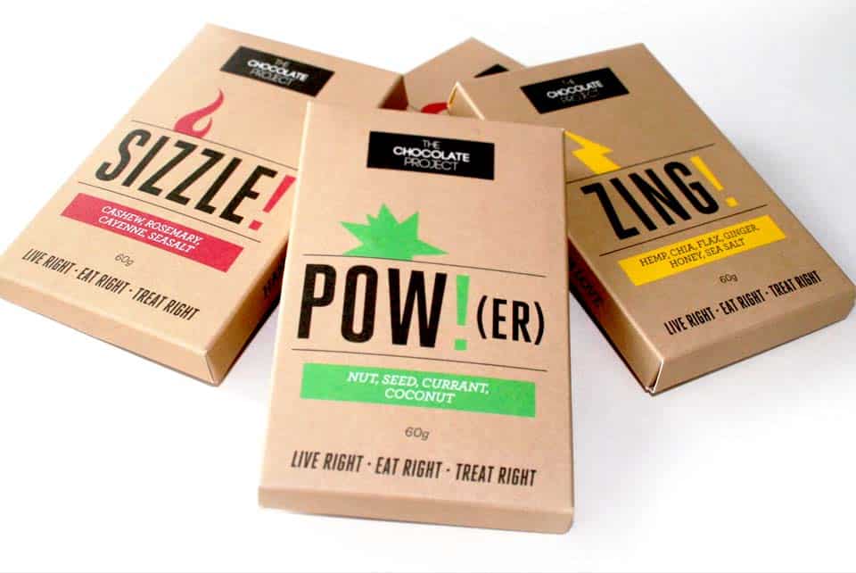
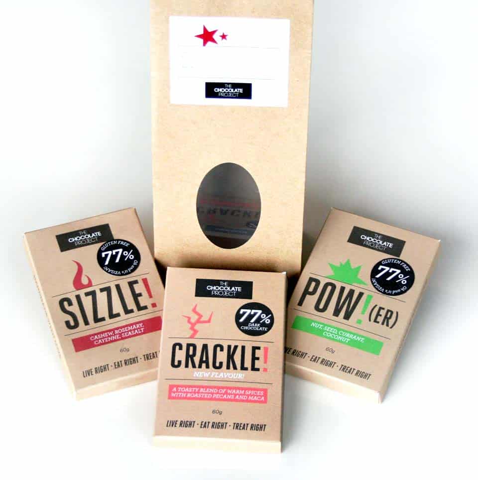
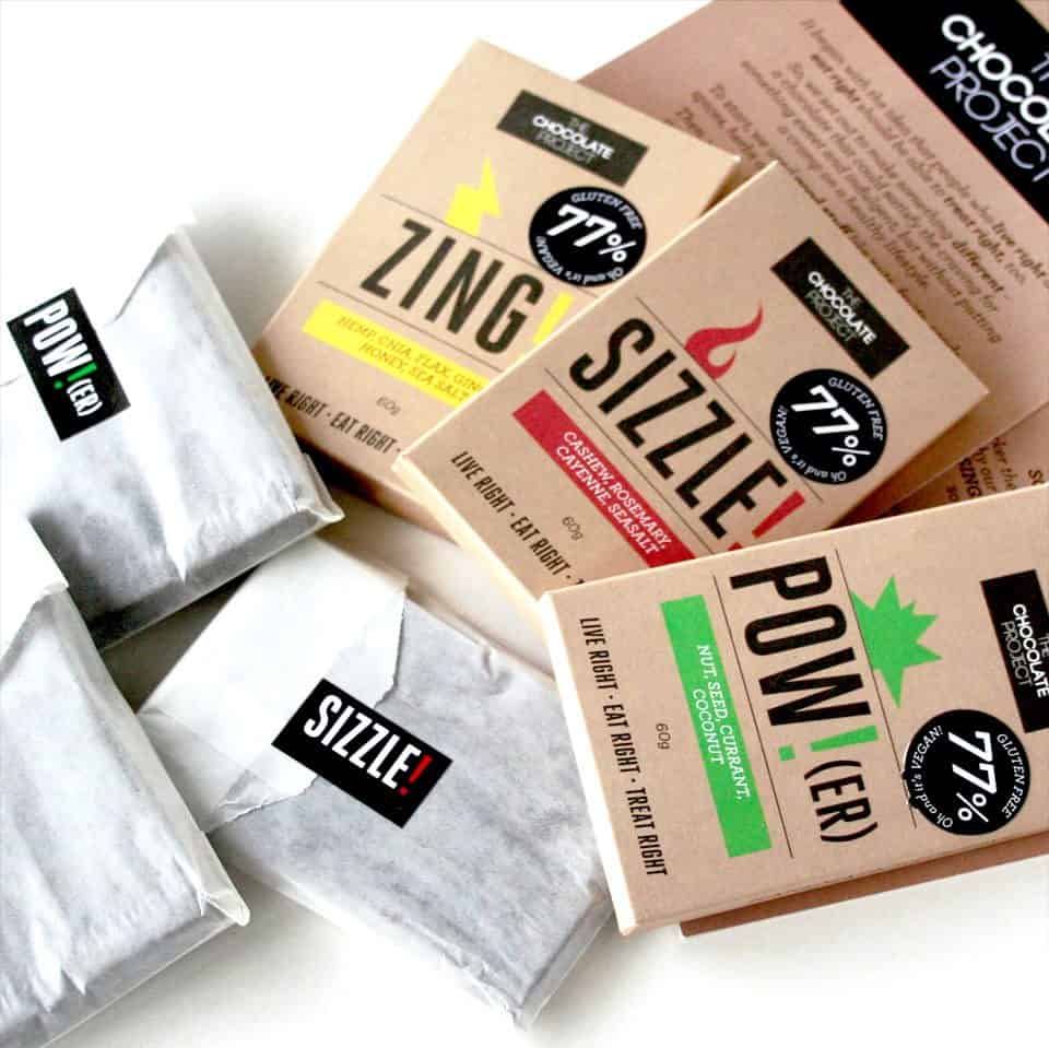
Tasked to create an identity and roll out packaging for a hand-made chocolate company. We worked with a copywriter to name the flavours and created a consistent package design with simple typography and a flavour-based symbol to accompany each design. Used natural raw paper to convey the stripped-back organic quality of the product juxtaposed against bold, flashy colours to give it shelf presence. The package was designed to be easily assembled by hand.


We were continually told by retailers that the packaging was a key player in the sales of the product. Many buyers were enticed to buy it based on its look without even knowing what the product was.